Future Temples: A History Of London’s High-Tech Architecture
By Something CuratedDeveloped in the late 1960s, High-tech is arguably one of the 20th century’s most influential yet overlooked architectural styles. Based on a steadfast belief in the potential of technology to improve people’s everyday lives, the movement turned the aesthetics of industrial design into an art form through a celebratory display of a building’s construction, materials and adaptability. At the centre of this movement were an influential group of British architects – Sir Richard Rogers, Norman Foster, Sir Michael Hopkins and Sir Nicholas Grimshaw – a number of whose earliest and most iconic High-tech designs were realised in the capital.
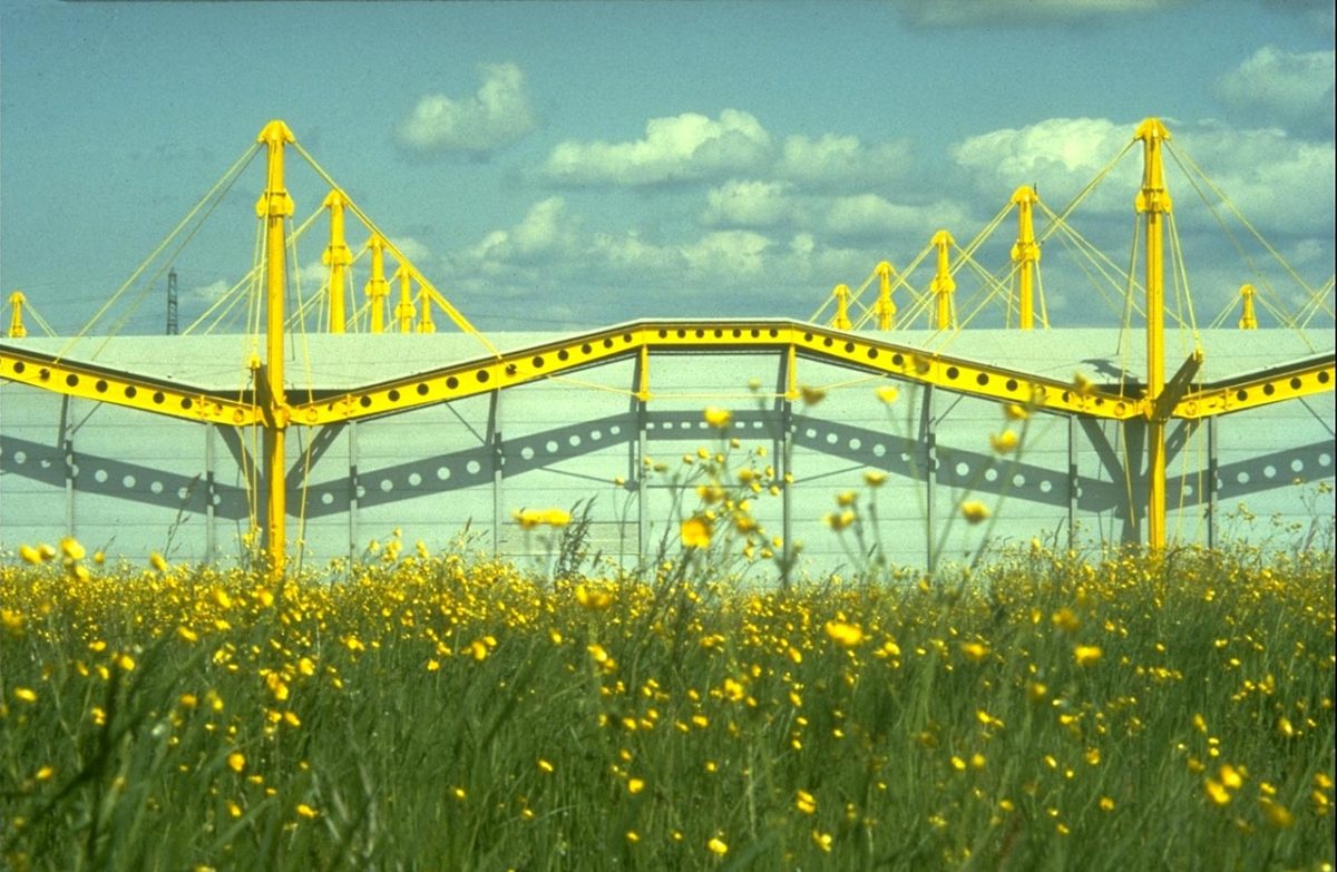
Sometimes referred to as Structural Expressionism, High-tech architecture gained its name from Joan Kron and Suzanne Slesin’s best-selling interiors book High Tech: The Industrial Style and Source Book for The Home (1978). Following the optimism of mid-century style and the frivolities of the swinging pop aesthetic, the movement saw a return to the stripped back approach of Modernism and its celebration of the machine aesthetic. Yet, whereas the first wave of modernist designers such as Eileen Gray and Marcel Breuer had been inspired by or borrowed from industry, High-tech took an appreciation of technology to a fanatical and fetishistic level.
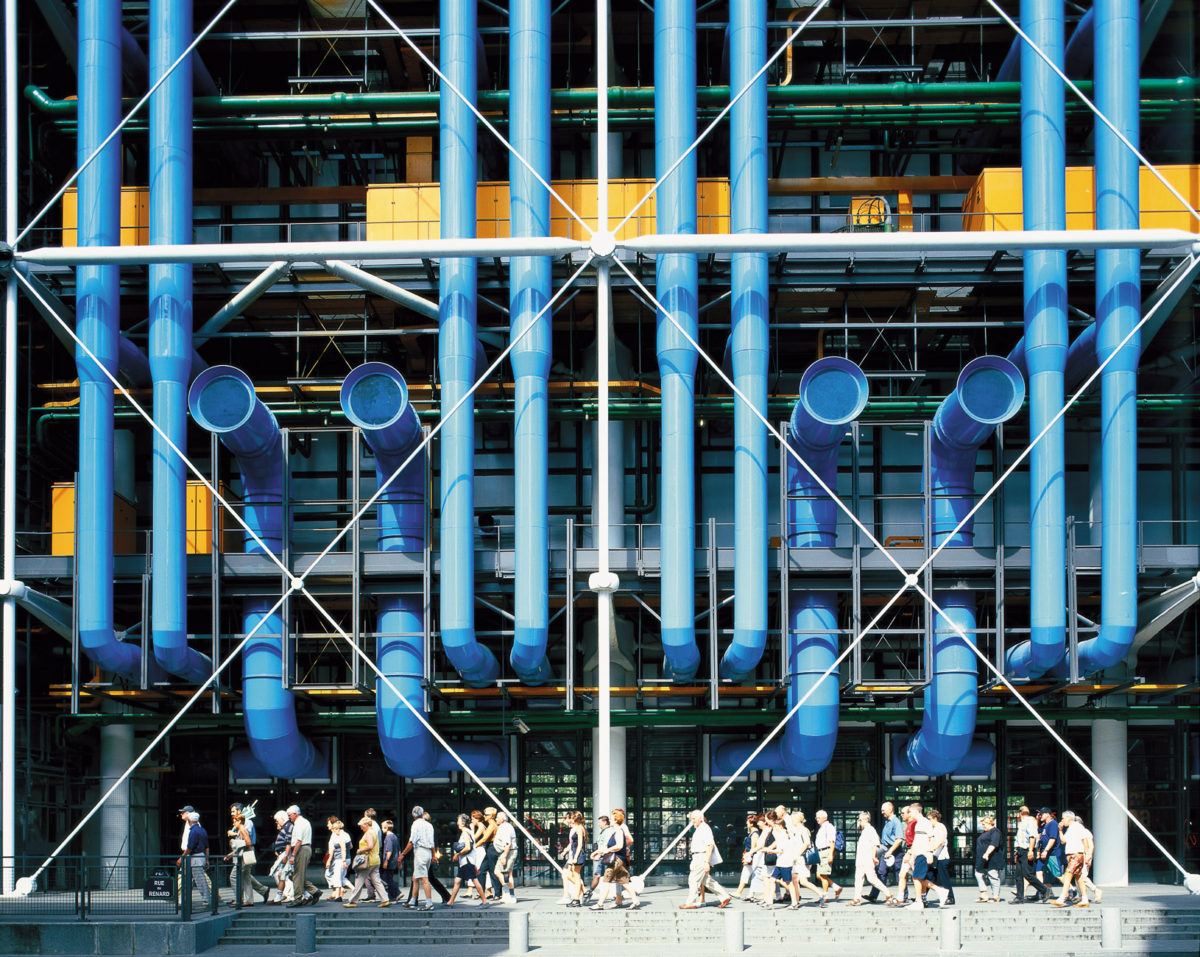
Industrial structures and materials are at the forefront of the High-tech style with services placed on the outside of buildings to provide more flexibility for the interior space. Initially a functional device, this developed into a stylistic motif of its own with architects intentionally exposing pipes, girders and joints, sometimes even painting them in primary colours to create focal points from previously overlooked elements of a building – as with the Pompidou Centre (1977) designed by Richard Rogers and Renzo Piano. Subsumed into the mainstream, many of the tropes of High-tech architecture have become commonplace in modern construction. This, however, does not detract from the innovative buildings of designers such as Rogers, Hopkins and Grimshaw, which can still be seen in the capital.
The Crystal Palace, 1851 || Joseph Paxton
Though from a much earlier era, Joseph Paxton’s Crystal Palace shares similar characteristics with the High-tech architecture that came after it. Paxton’s Crystal Palace was built to house the Great Exhibition of 1851 held in London’s Hyde Park. Inspired by his experience designing greenhouses for country estates, Paxton used pre-fabricated fixtures and fittings to create an innovative glass and iron ode to the industrial revolution.
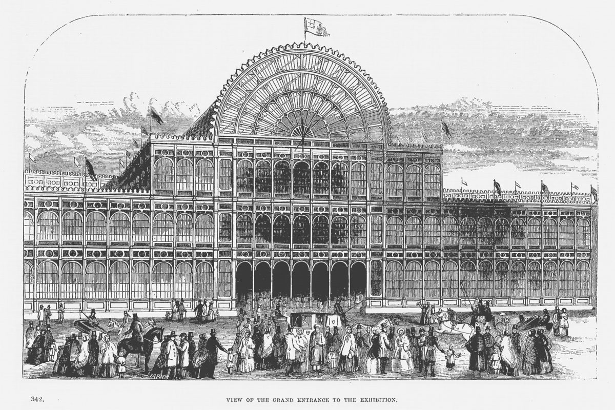
The modular design meant that the vast structure, covering an estimated 990,000 square foot, could be easily erected and disassembled following the exhibitions six month run. After much debate, the Crystal Palace was relocated to a park in Sydenham where it would host a number of events including the Festival of Empire in 1911 before eventually falling into disrepair and burning down in 1936.
Park Road Apartments, 1968 || Sir Nicholas Grimshaw
Though modest in appearance, Park Road Apartments remains one of London’s most significant modern housing projects. The Grade II listed building was the first residential property in the UK to be built around a central core borrowing principles of commercial design to offer residents 70 variations of interior plan.
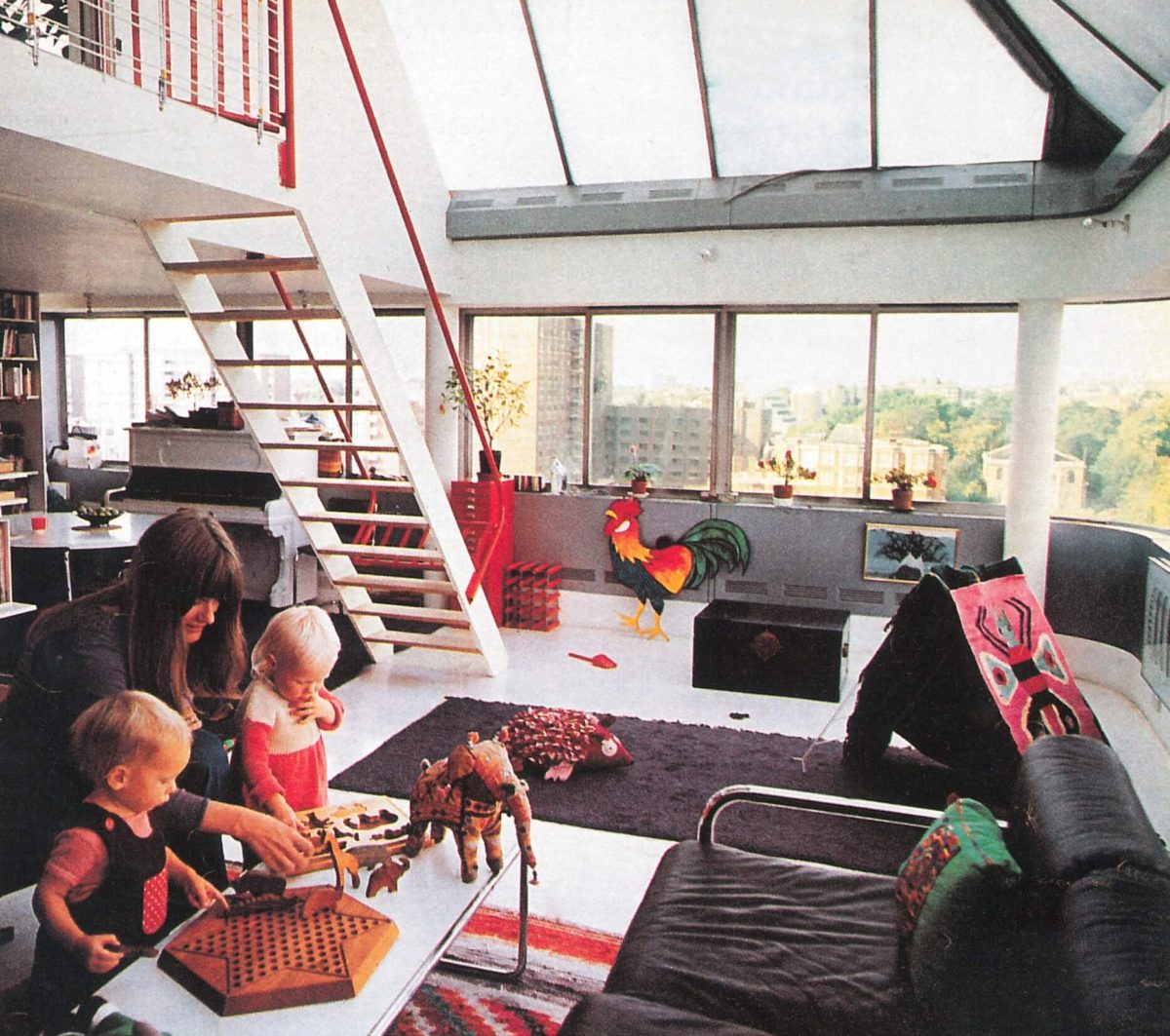
Alongside its concept of flexible, open-plan living, Park Road Apartments is notable for its inventive use of industrial prefabricated elements. Clad in corrugated aluminium to provide a futuristic look, Grimshaw sourced all of the glass from a manufacturer of bus windows to not only give the building its curved corners but also extensive views over nearby Regent’s Park. Architect Sir Nicholas Grimshaw was so pleased with his design that he made one of the apartments his family home for six years.
Rogers House, 1969 || Richard Rogers
While the box-like, single story layout and large panes of glass evoke the slick lines of a Mies Van Der Rohe design, a bright palette and innovative use of materials sets the Rogers House apart from such stark concrete predecessors. Aluminium sheets adorned with colourful plastic coatings provide the walls and interior partitions, many of which can be moved to reconfigure the space, while even the welded steel skeleton that holds each building together is painted bright yellow.
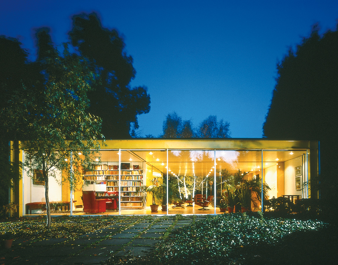
Consisting of two prefabricated structures, the Rogers House is located directly opposite Wimbledon Common. Designed for the architect’s parents, the eponymous house was one of Rogers’ first commissions and has since been recognised as a seminal work with the award of a Grade II listing. In 2015 Rogers donated the building to the Harvard Graduate School of Design where it is now used as part of a research fellowship.
Hopkins House, 1976 || Sir Michael Hopkins
Part family home, part studio space, the Hopkins House sought inspiration from the large-scale commercial projects the architect was designing for his practice at the time. Nestled in a leafy Hampstead suburb between rows of Victorian and Regency housing, this two-storey block is built around a steel grid with a facade of floor to ceiling glass and corrugated metal decking separating each floor.
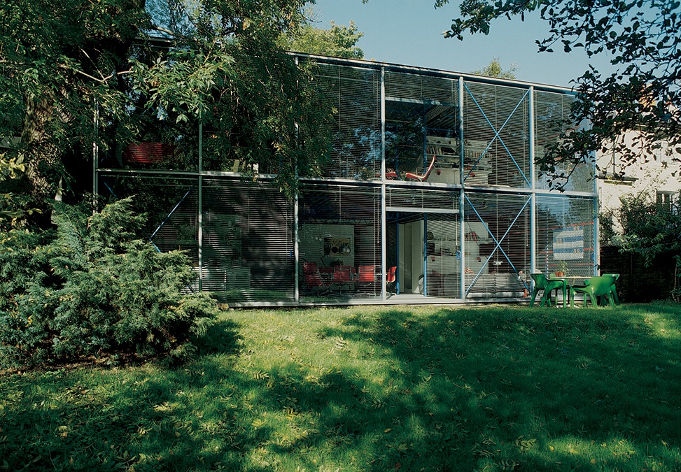
Whether due to aesthetic judgements or the financial and planning restrictions faced by Hopkins, the functional simplicity of the building and its interior decor perfectly encapsulates the pop goes industrial look of the period. The track lights, metallic venetian blinds and a spiral staircase made from embossed steel look as though they have been lifted straight from Kron and Slesin’s High-tech sourcebook (see above), while the use of primary colours is a clear homage to the rigidity of Bauhaus modernism.
Lloyds Building, 1986 || Richard Rogers
The winning entry in a competition to redesign a British banking institution, from the moment Richard Rogers Partnership (RRP) plan for the Lloyd Building was unveiled it has divided opinion. Undoubtedly one of the City of London’s most iconic landmarks, the metallic towers stand in stark contrast to the neoclassical, faux-deco and postmodern pastiches that made up much of the areas construction boom throughout the 1980s.
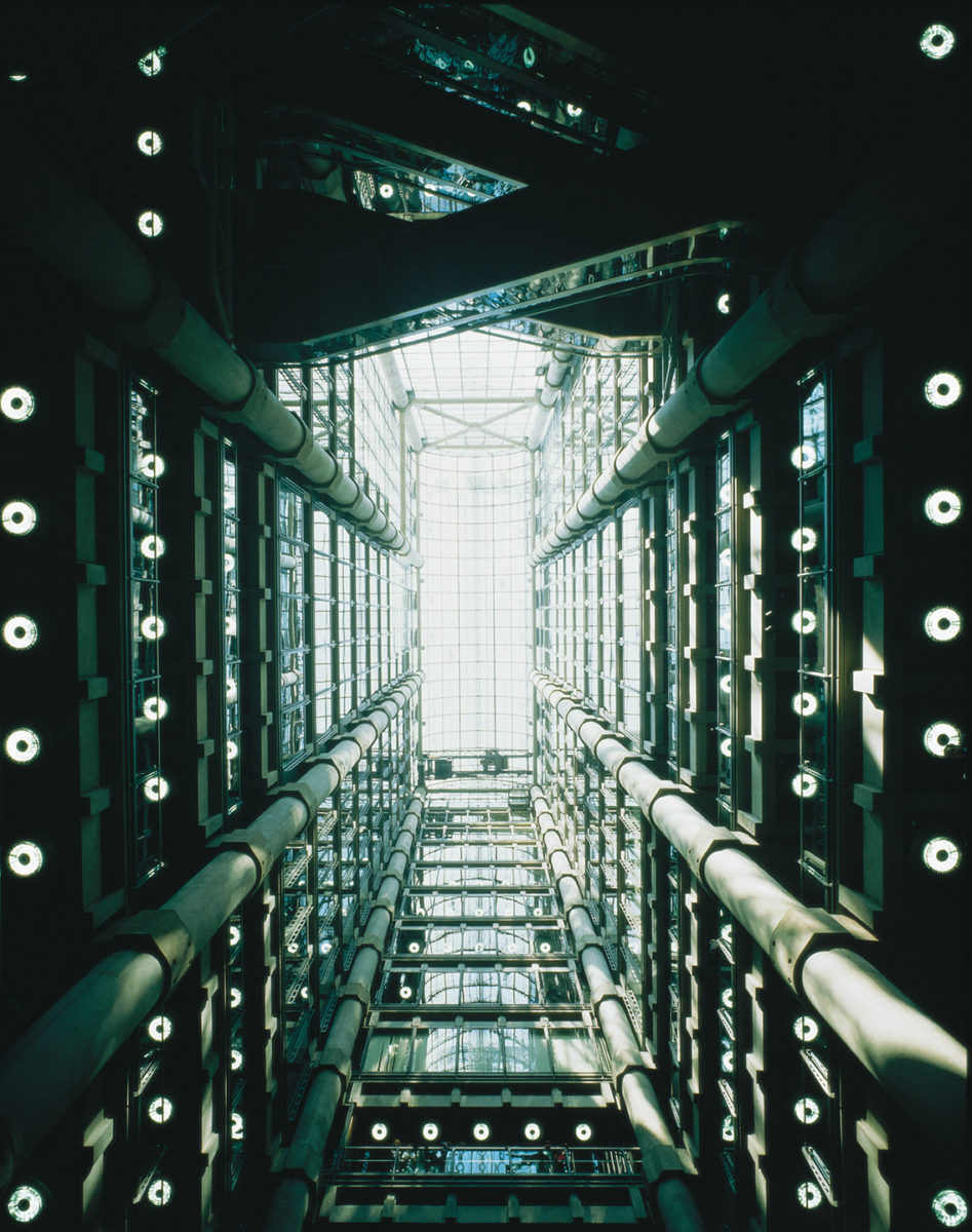
Unlike previous Rogers’ designs, such as the aforementioned Pompidou Centre, the Lloyds Building is almost devoid of any colour bar the occasional blue girder. Instead, service stairways, pipes and cranes are left completely unfinished giving the building the appearance of a giant engine that is almost gothic in its levels of detail. This cold, mechanised aesthetic provides an unintended metaphor for the accelerated pace of the international financial sector during the period.
Feature image via The Modern House | Words by Dale Marshall