Gary Card: Fashion’s Go-To Set Designer & Illustrator
By Something CuratedBournemouth-born and London-bred, versatile talent Gary Card has established himself as London fashion’s go-to set designer, illustrator, costume maker and sculptor, among other titles. The Central Saint Martins graduate moved to the capital to pursue a degree in Theatre Design, and has since built up an impressive roster of clients, designing sets for Balenciaga, Marta Jakubowski, Charles Jeffrey, headpieces for Comme des Garçons, and store interiors for Roksanda Ilinčić.
Card, who identifies as a designer rather than an artist, is heavily influenced by sci-fi and comics, in particular, the works of American cartoonist Jim Woodring. After graduating from CSM, he took up a job at his old students’ union and caught the attention of the late Matt Irwin, a photographer who was working at the university’s magazine at the time. He was invited by Irwin to contribute to the publication in different aspects, including illustration, graphic and set design, kick-starting his career. His first venture into fashion was through creating elaborate headpieces for a shoot with AnOther Man, in which he discovered his trademark medium – cardboard. He soon made the rounds to other well-known titles, starting with Dazed & Confused, where he worked regularly with stylist Nicola Formichetti.
Translating his diverse experience to spatial design, Card collaborated with LN-CC’s founder and former creative director John Skelton to produce the interior of the Dalston concept store, which was nominated as the London Design Museum’s ‘Design of the Year’ in 2012. The original Card-designed space included three concept rooms, a book and record store, a club space and a fully functional photography studio. It is a completely immersive sensory experience as visitors encounter different climate controlled rooms, with varying narratives of eco-consciousness, textures, and space.

Highlighting the “importance of being a chameleon,” in an interview earlier this year, Card expands on the benefits of his flexible approach, a talent required when one day you’re building a carousel for Marta Jakubowski, and the next, copper animals for Hermes. Adaptability and the capacity to multitask are key skills in this fast-paced industry, with Card’s list of projects for Fashion Week alone seeing many overlapping deadlines. One of his many Fashion collaborations includes Serbian born Roksanda Ilinčić. The chemistry between her hyper feminine silhouettes and his knack for designing captivating settings is evident throughout their collaborations, especially in her Spring/Summer 2016 show, for which Card transformed a Grade-II listed sports hall into a maze of cut out geometric shapes made from MDF.

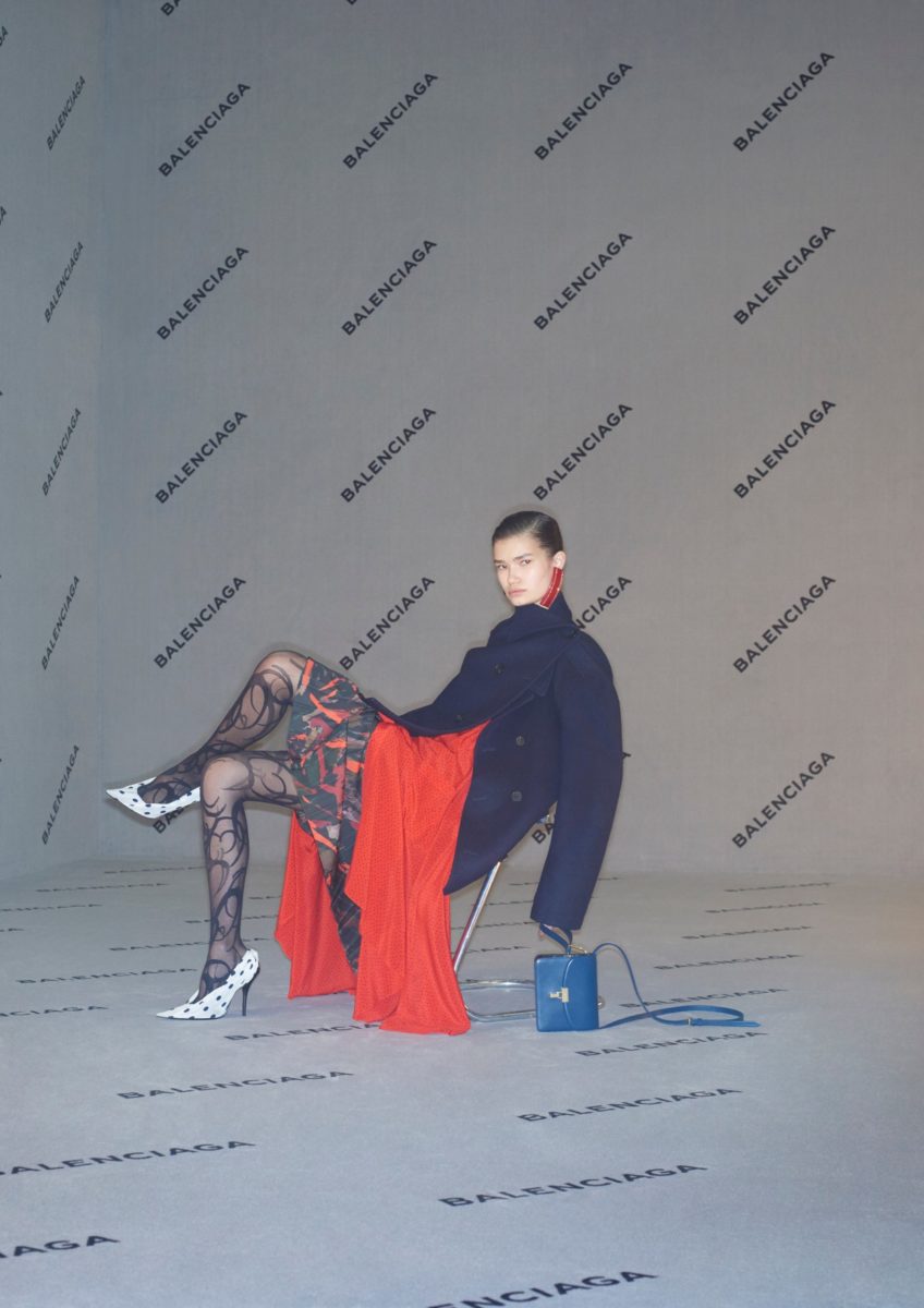
More recently, developing a backdrop for Balenciaga’s Fall/Winter 2017 campaign, shot by Johnny Dufort and styled by Lotta Volkova, Card created a fully carpeted set with the brand’s logo stamped in repetition. A very “toned-down” variety of his work, when you compare it to his psychedelic sculptures and illustration, but a perfect reflection of the house’s creative director, Demna Gvasalia’s philosophy of “enhancing, underlining and representing that which already exists in a new light.”
LOVERBOY founder Charles Jeffrey quickly recognised Card’s distinctive vision, partnering with the designer shortly after entering the London fashion scene to produce costumes and props for multiple runway shows. Jeffrey’s debut Fashion Week offering, a part of the Fashion East initiative, involved the construction of giant futuristic deities, later displayed in London’s Dover Street Market, which punctuated LOVERBOY’s A/W ‘17 show. The duo’s synergy carried over to S/S ‘18, where Card produced an even larger scale series of props for Jeffrey: a troupe of dancers adorned in pink-painted cardboard creations, emblazoned with energetic scribbles.

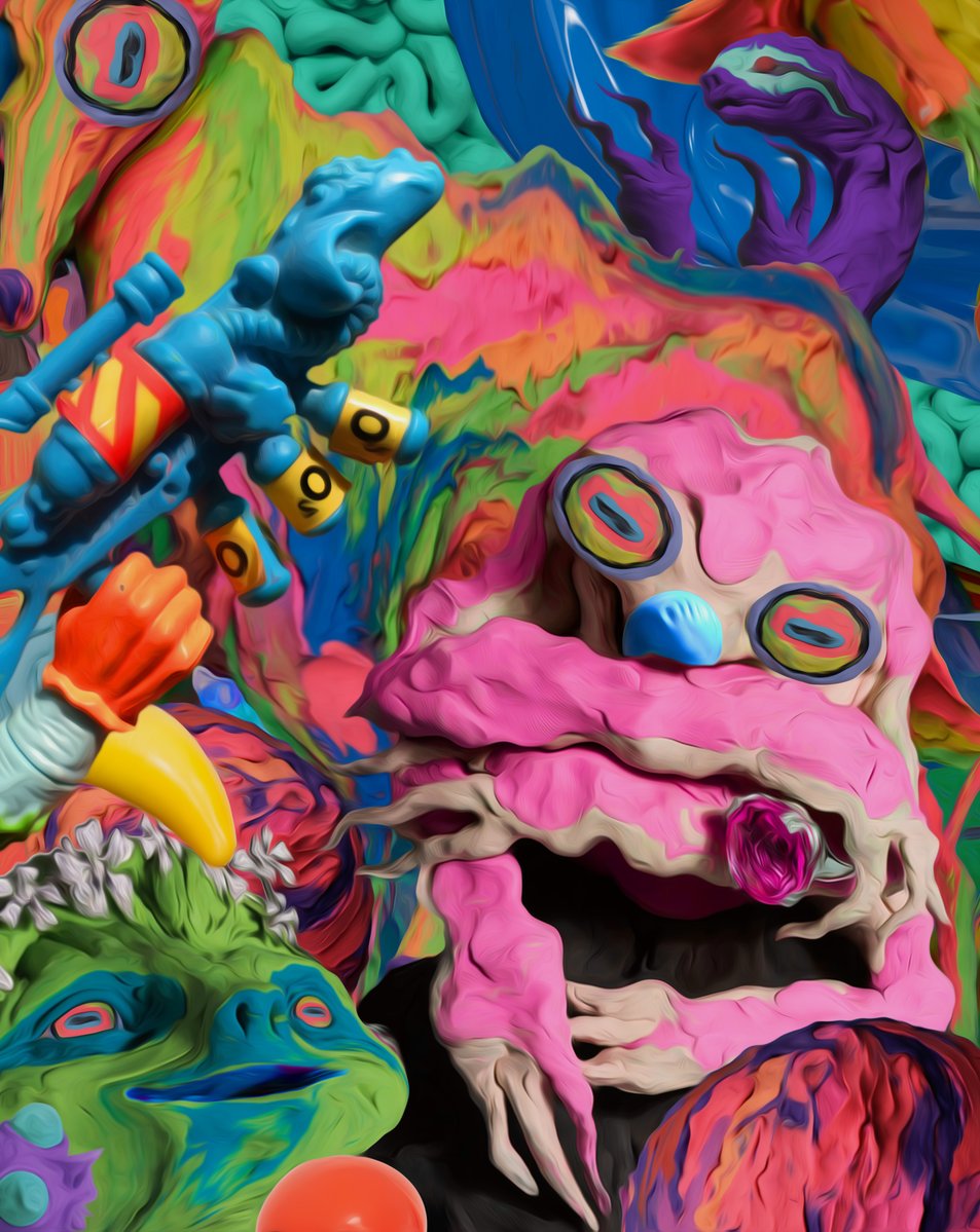
The span of his career thus far has seen Card being a critical part of numerous fashion shows, photoshoots and events, and in 2013, the designer held his first exhibition, featuring a range of forgotten projects dubbed Abandoned Amusement Park, at east London’s Eternal Youth Gallery. Free from a client or any commercial restrictions, Card showcased his creativity in its purest form through 300 rolls of masking tape, forming a series of grisly creatures. Most recently, Card applied his resourceful use of colour and grasp of form to create a limited edition zine, entitled Happy Breakfast, celebrating “the process of making.” The publication is a nod to the designer’s part in the mid-‘00s new rave scene, filling 22 pages in visceral greens, blues and vivid yellows.
On finding the right balance between his creative thought process and the task at hand:
“Sometimes you have to rein in your imagination. I like creating bonkers stuff but as a designer you always have to remember your brief and find the right balance between perfectionism and spontaneity.” — The Times, 2013
What his desk says about him:
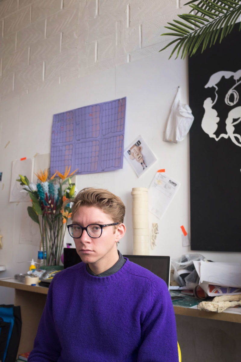
“It says that I’m extremely unorganised, very messy and that I like colourful things. I have another desk in my studio in Hackney and the mess there is ridiculous … My studio has four massive desks in a row, which are completely covered in art materials, clay, stacks of paper and past works that I just haven’t had the heart to throw away.” — Matches Fashion, 2013
On his childhood:
“My childhood fascinates me to this day. In so many ways I still feel like a kid; sometimes I find it incomprehensible that I’m approaching my mid 30s! So many of my references stem directly from the cartoons, toys and comics from back then, they are hard wired into my psyche and almost impossible to avoid.” — i-D, 2014
Words by Trishna Goklani