Interview: Olu Michael Odukoya, Creative Director & Publisher Of ‘Modern Matter’
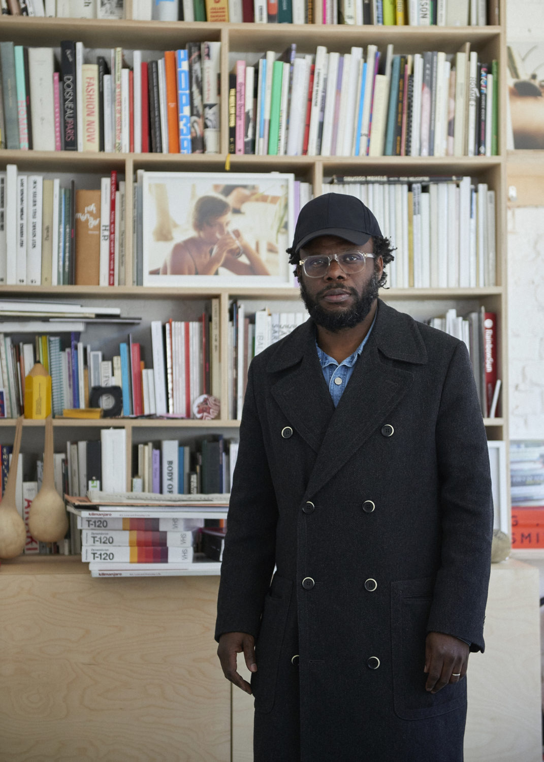
By Keshav AnandLondon-based creative director, publisher and curator, Olu Michael Odukoya regularly collaborates with eminent brands, artists and galleries, including Balenciaga, Sarah Lucas and Sadie Coles HQ, among others, both independently and through his creative agency OMO Creates. Earlier in his career, he worked with then Yves Saint Laurent creative director Stefano Pilati as art director of the brand’s advertising campaigns. He was also the launch art director of POP and currently publishes the brilliant art and lifestyle magazine Modern Matter. Discussing his career, his seminal work on Kilimanjaro magazine, and his upcoming foray into furniture design, Something Curated spoke with Odukoya at his Bethnal Green studio.
Something Curated: Could you give us some insight into your role?
Olu Michael Odukoya: I’m almost like a prophet of creativity. As a creative director, I promote ideas. The artist Robert Rauschenberg talked about an artist’s role being to create something that was about their time, to present and navigate that. I always felt my position was something similar. I present work not necessarily based on my style, but rather to navigate present culture.
Recently I made a book with Oscar Murillo, with family pictures from when he came to England from Colombia, showing the various living conditions he experienced. Given that he’s a painter, it’s unusual to make a book about photography. Within the book, I decided to curate the images alongside a load of empty pages. This is because Oscar is actually going to paint on them to finish the book off. I felt you can’t just record the past, you have to show now. This is like a life book and each edition is totally different. It’s a book, but a book is just a material, and you can change the way people look at materials. That’s my goal.
SC: Can you talk to us about your journey into the field; how have you gone about carving this unique position for yourself?
OMO: I was a little bit lucky and I was always so diverse with people. I first started an independent magazine called Kilimanjaro. It was a difficult project to get started. We actually won an important design award for the first issue but at that time there was no office; we would meet in a pub and I would work on it one day a week while I was training to be an optician. I always felt like I understood people, I didn’t know which medium to reach them through or how to sell them something, but I knew how to connect with them. Kilimanjaro is named after a place, so already the conversation is very open. With Modern Matter too, the title just describes what you are looking at now. Everyday is a modern matter, and it changes all the time.
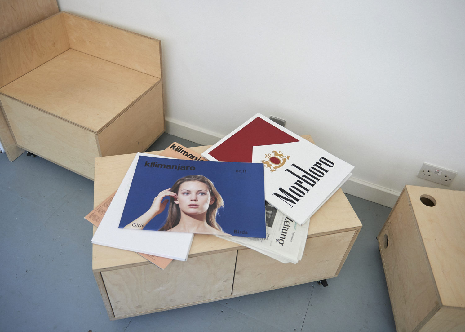
By chance people loved Kilimanjaro, and I got called to work for the advertising agency Fallon, and from there I went to re-launch POP Magazine. My journey has been so diverse, and that’s because I’ve always dealt with so many diverse people. From POP I went to Yves Saint Laurent to work with Stefano Pilati; he had actually discovered my work through Kilimanjaro. And after that I set up my own studio, OMO Creates, and started Modern Matter. I never sat down and thought I want to set up a studio, it was more that I just wanted to do different projects and work with different people. My studio is more about projects; it doesn’t have an everyday routine. In the same way, each issue of Modern Matter is totally different.
SC: What was your experience like working with Stefano Pilati?
OMO: Stefano loved my work and asked me to be the art director, so I worked with him to develop the advertising campaigns. I got my first ever studio through them – they helped me set-up a studio here in London because they felt it would be better if I didn’t share the same office as them, to encourage my own perspective. I met a lot of great people through working there.
SC: Can you expand on the various strands of OMO Creates’ output?
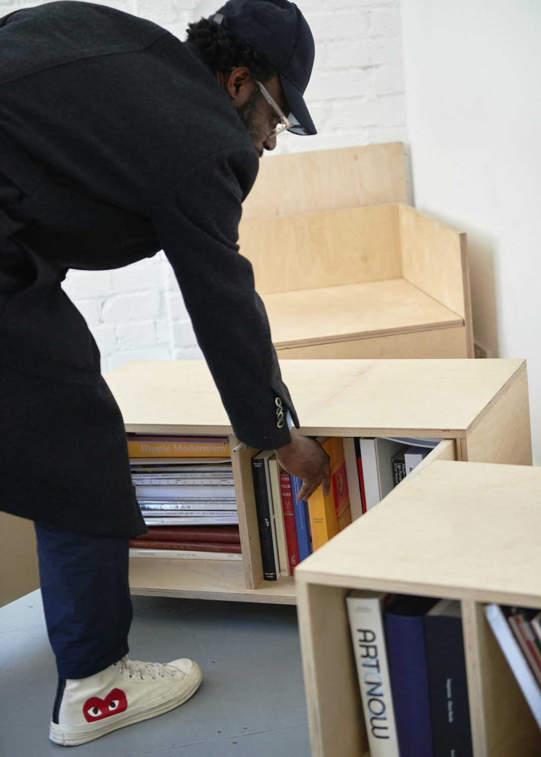
OMO: Book design, film, fashion, art and curating – it’s a practice for art and design. We do art books for galleries like Victoria Miro and Sadie Coles. We also do fashion and design, and that’s led onto furniture; we make chairs now. We’re calling the chair Joko, which sounds very Italian, but it’s actually an old African word meaning “sit down.” It’s a natural human need for us to sit down – we eat and sit down, we have a conversation and sit down – and this is really what interested me in the project. It’s probably going to be launched later this year in Milan.
SC: What was the thinking behind creating Modern Matter?
OMO: In the beginning, with Kilimanjaro, the magazine was very avant-garde and it was difficult to make it something commercial. And when I initially started Modern Matter, I wanted to make a very commercial men’s magazine – it was actually going to be called Matter. We wanted people to understand clearly what it is; we were ready to put it in a box. But ultimately it didn’t feel right, and then Modern Matter came about. It’s really about embracing the ideas of an independent magazine in a time when digital was really flourishing. But I felt with analogue, there was a different way of telling the story. We’ve been publishing the magazine now for six years.
SC: Can you tell us about the concept for the most recent issue, Remastered?
OMO: The Remastered issue is based on the idea of creating a magazine that has the concept of some kind physical form beyond a standard magazine. I wanted it to feel like a solution to an idea, rather than just posing a question to the audience. With Remastered, we made the magazine digital in a way. So we printed the magazine in two different profiles. It’s the same magazine twice but printed differently. I wanted to cheat the machine. You’re looking and the magazine and by the time you cross halfway, it’s been remastered. And in-between, I want you to stop. I like that idea that halfway you are told to stop, to pause. With this call for action, the magazine becomes a conversation. The whole idea of a magazine is to push an idea to the audience, but in this case, I want the audience to respond back.
SC: How do you think about generating and presenting content for each new issue – could you give us some idea of the timeline?
OMO: It’s an on-going thing but to put the magazine together usually takes two weeks. The conversation is always coming from the issue before. I never really give a theme to my magazines because I feel things can become repetitive. Whatever I’m into at that time, the magazine is a continuation of it. I haven’t started the next issue yet but I already know what the content is supposed to be. And that’s the natural way of working on a project for me – you look at something and it tells you what it’s supposed to be. It’s your gut. In between that, we are always working on catalogues, books, now the furniture, and other projects. And in a way, they are all the same thing. Some design in a catalogue will become relevant to a concept in the magazine, and vice versa.
SC: What draws you to certain collaborators?
OMO: I like people who have their own vision. I enjoy working with Juergen [Teller] – he has his own vision and he’s always trying to do something that is true to himself. I enjoy working with Lotta [Volkova] too, she has a very original perspective; we worked together with Demna [Gvasalia] on a Balenciaga campaign. In terms of artists, I love Sarah Lucas, she’s very independent – most of the projects we do, she makes everything herself, and she doesn’t have a studio, she works from home. There are many more collaborators I have enjoyed working with, but I suppose in the end, I’m attracted to people who have similar ways of working to me.
SC: How has the industry, and in turn your working approach, changed over the last decade?
OMO: It has changed a lot but, for me, I think it’s been really good. Everything has become so the same, and everybody knows what things should be and look like, and with the Internet people are getting their information directly from the artist rather than through a secondary media source. With Modern Matter, there was an opportunity to do something differently. The Remastered issue already sold out. You don’t go to a magazine shop and see a magazine inside a VHS cover; and when you do, you want to pick it up, you want to understand. Everyone’s so aware of what a magazine is supposed to be, when you see a magazine printed twice in one issue, you get it straight away that this is not a usual magazine. With the Mother issue, we made a Child supplement in miniature, and people loved that. People bought the magazine because of the little version. I feel like with all those pre-set codes, I have the freedom to tell different stories.
SC: Favourite cultural spaces in London?
OMO: I love Hamleys. It’s the only place you go where all the staff are so happy to sell you something. Whenever I’m in town, I always like to pop in there and look at all the toys I should have got when I was ten. [Laughs]
SC: Favourite restaurant?
OMO: St. John.I love how they use all the different parts of the animals; especially coming from Africa, we like to eat everything.
SC: Preferred work attire?
OMO: I love black. It’s durable, it’s don’t mess with me – I respect black. In terms of designers to wear, I love Christophe Lemaire. You don’t really see it in pictures but when you wear it, his clothes are really great. I also love Demna [Gvasalia], he’s really smart, and Phoebe Philo.
SC: What are you currently reading?
OMO: I have to say, I’m dyslexic. I’ve never read any of my magazines. I’m the sort of guy that counts how many people are in the picture. I like to talk but reading, I’ll pass on it. [Laughs]
Interview by Keshav Anand | Photography by Michiyo Yanagihara